A Punchcut tool for UX differentiation
UX spectra in action
Every design project (should) start with soaking up as much as you can about the problem space, its users, and your stakeholders. Usually, that involves immersion, desk research, and if you have more time, field research and quantitative studies. And part of any good soak is a competitive and comparative evaluation in which you analyze your competitors and take inspiration from non-competitors. The goal of these evaluations is to find opportunities that help you position your product’s experience in the market.
These audits have been part of the design process for decades. We’ve seen them done in many ways. On one side of the scale, you can rush through them and check the box that you did one. On the other side, you can spend a lot of time meticulously analyzing and not moving forward. In today’s world where design projects move at breakneck speeds, we need the speed of the former with the robustness of the latter. At Punchcut we’ve developed a method to take advantage of the benefits of both sides and we want to share that with you.
Let’s dive into the UX Spectra exercise.
What are UX Spectra?
UX spectra are a set of scales which measure opposite attributes that describe an experience. In the context of competitive and comparative evaluations, after defining the UX spectra, we simply plot where each example falls in each spectrum.
Why is this helpful? A good UX process is well connected and accountable. At the end of each project when your team has reached a design solution, there should be a logical through-line that can be traced back through each step and to a very strong foundation laid in the beginning. The UX spectra is a tool that contributes to that foundation.
In this post, you’ll see our process from the lens of evaluating travel sites. Travel and mobility are one of many domains we actively work in. Although we’ll be showing screen-based experiences in this post, UX spectra can be used on any type of experience. For example, at Punchcut we use them as much for touch-based design like wearable or automotive as when we design screenless experiences like IoT or voice agents.
OK, let’s get into it. Here is a 4 step overview of how to do a competitive and comparative evaluation using UX spectra. We’ll also share the love and give you the downloadable template at the end of this post.
Step 1: Collect the Landscape
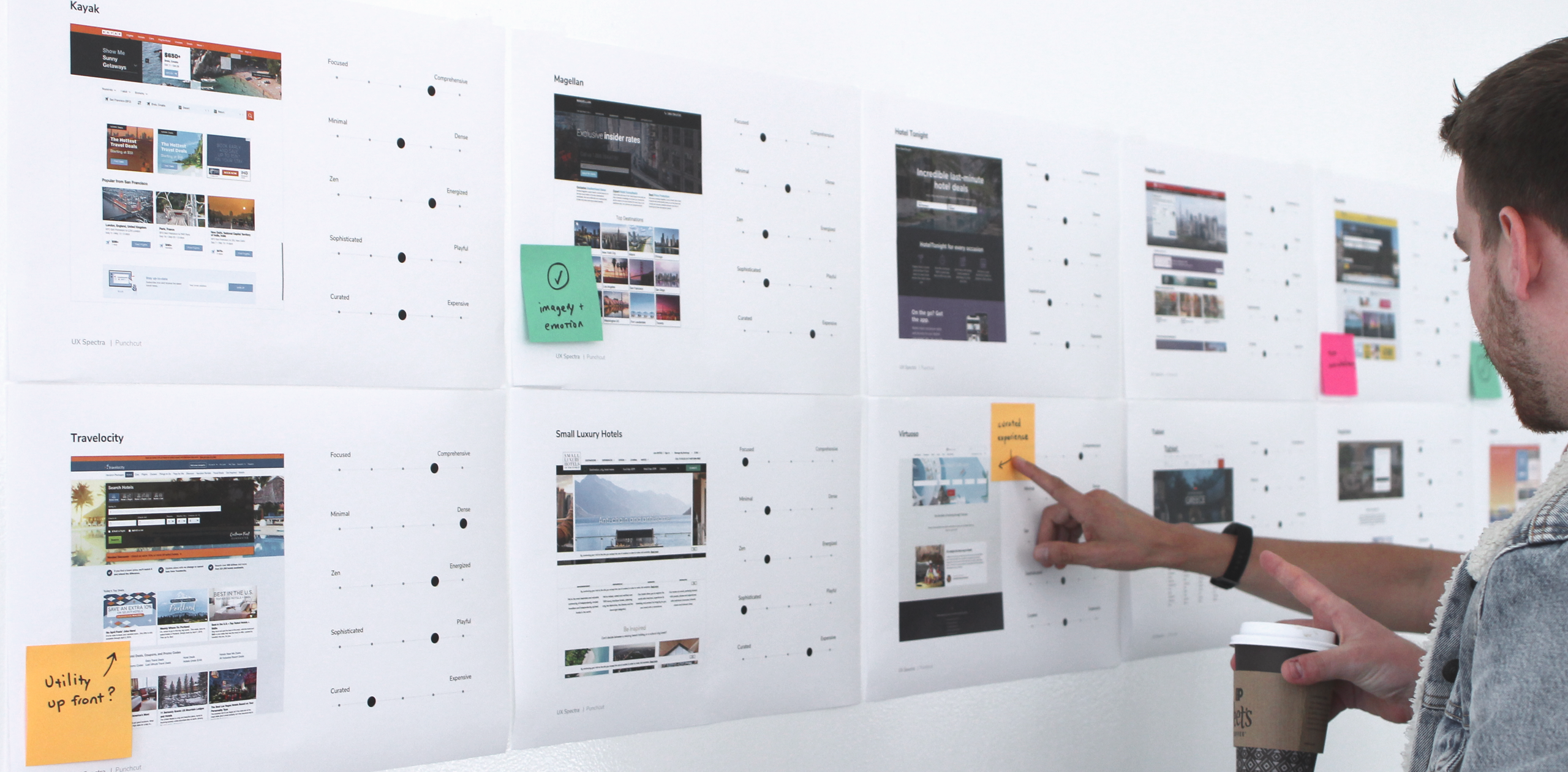
Take screen captures of as many competitive examples as you can, including your product. Capture the landing experiences. Capture the hero flows. Then group them all together, print them out, display them on a large screen or wall, and step back. Consider this your 10,000-foot view of the landscape condensed into a 10-foot view. You start to notice where experiences are similar and where they differentiate.
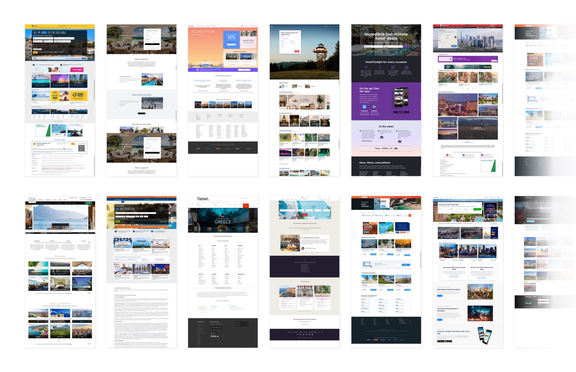
Grab screenshots of competitors and step back
Here’s an example of this exercise done on travel sites. Notice some patterns? Zoomed out, many of these sites look the same with some exceptions. How does our experience fare in comparison to the competition? We’re already starting to see hints of opportunities for visual distinction. There are also some sites that stand apart. These are good to note at this point too.
Step 2: Evaluate Against Each Attribute Spectrum
In this step, start by identifying the common qualities of your competitors’ user experiences. Create a spectrum for each quality and customize the template for your use, including a representation of each competitor under evaluation. While the web certainly has its best practices, your qualities will ultimately vary from industry to industry.
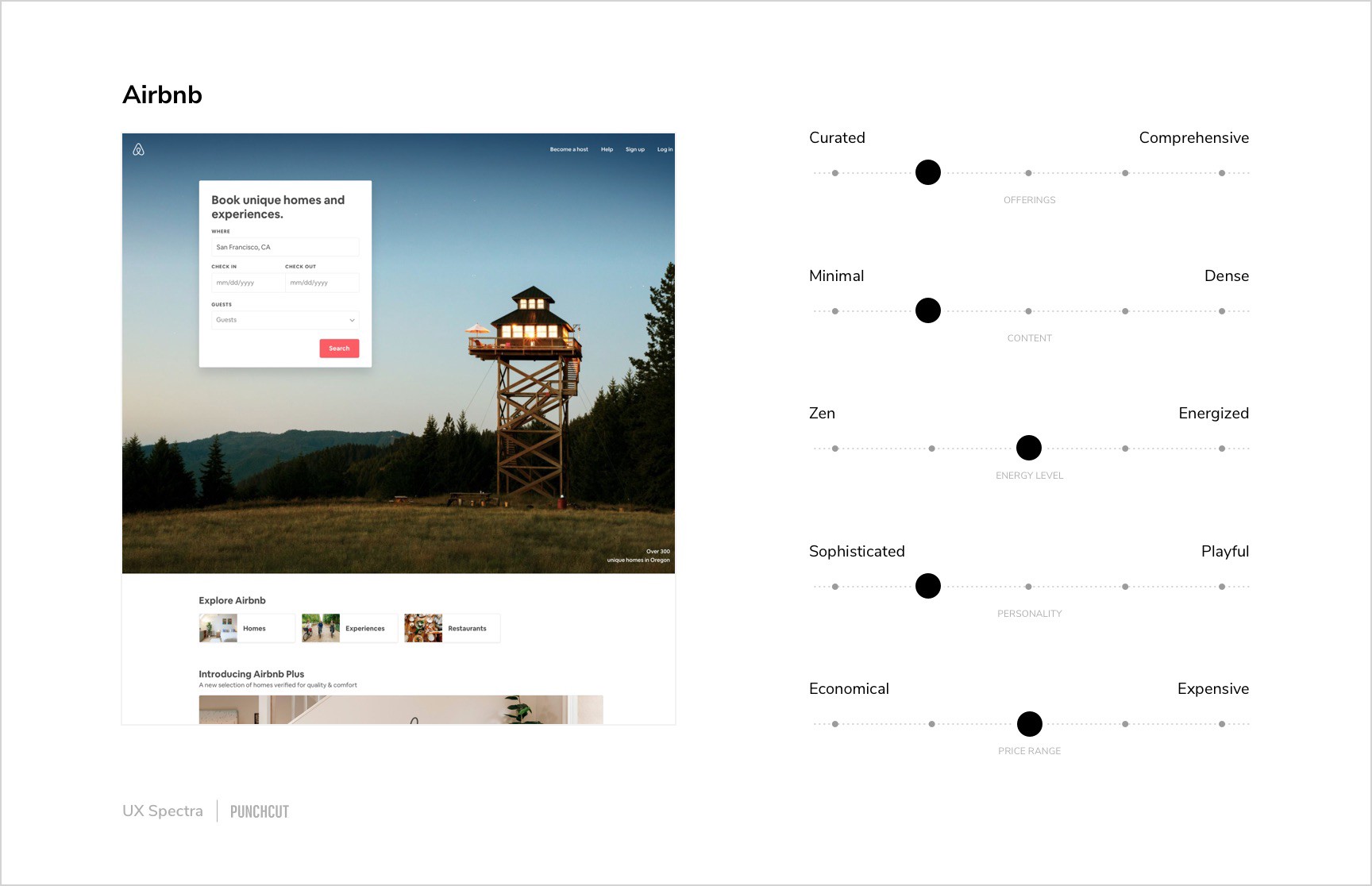
Your qualities may vary.
For example, in the case of travel sites we’ve identified the following qualities:
Information Density: How dense is the content? Is there room to breathe?
Feature Set: How comprehensive are the offerings?
Experience Feel: How does this site experience make us feel overall?
Visual Experience: How playful or sophisticated is the look and feel?
Content: Is the content highly curated or expansive?
Notice that although the previous step had you printing out the landing pages of each experience, these spectra are intended to capture a mix of qualities evaluative of the entire experience; overall UX, visual design, content, etc.
Now for each experience gathered in step 1, plot where its current qualities land on your spectra. This might seem tedious at first but it’s actually pretty fast, especially if you’ve already dropped them into the template. Now you can visually see each product’s holistic experience at-a-glance in comparison to each another.
Step 3: Identify the Opportunity
Now that you have your experience and your competitors’ experiences mapped on the spectra, it’s time to find where the opportunities are. In this step, combine all of the competitors into one unified set of spectra. The beauty about this is now in one diagram you can easily see the trends and where the gaps are.
These gaps are where potential opportunities await.
Gather your team and stakeholders and determine which gaps you want to fill based on your product strategy and user research. It’s not about creating a product that fills all the gaps. It’s OK to choose to be on trend for some spectra.
This is a great time for a dogma vs heresy discussion to decide where to differentiate. The dogma represents what seems to be the “right” or a common way of solving this problem in this industry. The heretical view might choose to consciously deviate or differentiate from the norm to seek distinction or separation. Neither of these are always right; in some qualities, you may seek the safety and recognition of common patterns, while other qualities are ripe for splitting away from the pack and standing apart.
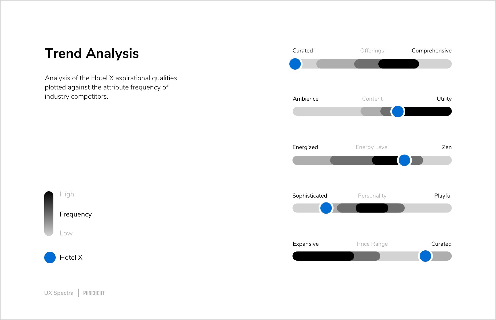
Check it out, all spectra in one place. Now find a spot for your new experience (Hotel X)
Step 4: Create the Vision
Congratulations! You’ve identified opportunities for your product experience. You now have the ingredients to begin your product vision. This vision should inform the rest of your UX strategy and research efforts. It should drive business goals and experience goals. Now it’s time to create the artifacts that will help teams align on this new direction.
The first thing to craft is the vision statement. The vision statement should be concise and include the qualities that you want your product to embody based on the opportunity exercise. It can also describe how your product can compete and differentiate itself from its competitors. We consider the vision statement to be a living artifact and update it as necessary. We reference it throughout the design process to ensure alignment.

Whoa, now we can build a UX Vision!
Secondly, pull together comparative examples that embody the desired experience qualities you just plotted. In our experience, comparative examples are where most of the inspiration comes from. We’ve observed many examples in comparative audits used because they meet the “this is cool” criteria. However, this method allows you to target your comparative audits more strategically.
In just a few short steps, you now have a north star for your product experience. We’ve found that as diverse teams (UX, hardware, engineering, etc) align around a shared experience vision and refer to it often, it helps smooths out potential conflicts while providing a common nomenclature along the path to launch.
This is just one of many exercises that we employ in product UX design at Punchcut. Next, we’ll share specific ways we bring strategic thinking to our visual design process.
Download the UX Spectra Templates (share with your friends)
We’d Love to Hear From You
Are you a designer? We’d love to hear how you’ve done competitive and comparative audits. And if you’ve used our templates, we’d love your feedback.
Are you looking for design expertise? We’d love to help you conceive and launch your next big product. Let’s talk.
A Punchcut Perspective
Contributors: Nick Munro, Reggie Wirjadi, Julian Brown
© Punchcut LLC, All rights reserved.